Add more space to headline in dashboard
In Dashboard the headline gets thinner while scrolling, but then the date picker (on hover) and customize button look squeezed. Perhaps the healine should stay with the space is has when at top.


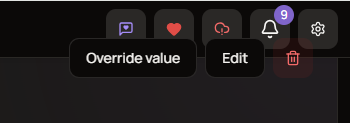
Additionally there’s a glitch in vehicle dialog while scrolling:
Log in to comment and vote
Comments1
Oct 9
PinnedThe squeezed look is intended, to give more space for the dashboard items. but agreed that 0 margin looks not that good. Will be fixed in the next release