Improve header in mobile view
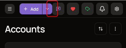
Since adding the drop down next to the + Add button there’s no space between add and the feedback button:
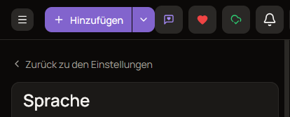
Additionally, translation of add in other languages isn’t short as the English one, so the settings button moves out of the view:

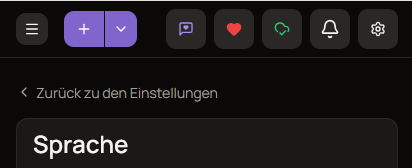
Two ideas are to either ommit the text in mobile view:
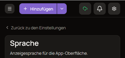
Or only show support and feedback buttons in if there’s sufficient space available:
But I don’t want to push you into going without feedback and support. Perhaps you have better ideas.
Log in to comment and vote
No comments yet
Be the first to share your thoughts.