Sankey chart enhancement
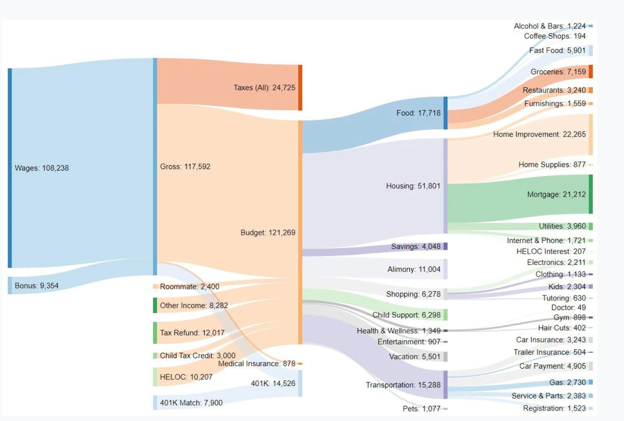
It would be better to have one more level in the expense /income category plotting the sankey chart. The chart should give a full picture how expenses flow in pictorial form otherwise it would be like the expense chart giving the top categories. I think one more level is enough to see the flow and this feature can be optional if someone likes the current format. Please find the sample attached screenshot for the reference.
Log in to comment and vote
No comments yet
Be the first to share your thoughts.